Thursday, 24 January 2013

Wednesday, 23 January 2013
Deciding on a digipak back cover
After having the dilemma I had with the front cover of my digipak I decided to re-think my back cover as well and had another look at all of my potential images.


I originally chose this as my back cover: (I decided on the font after designing this)

The positioning of the model works well but the frame had to be cropped to fit the dimensions of a digipak and this image was portrait:

The composition and strength of the image doesn't come across in the same way when it's cropped.

This is the image I decided to use for my back cover. The model is positioned in the same third as the previous image. I know the lighting isn't as strong as the above image but I added a pastel coloured filter to the image for a softer image. The model also looks more fairytale like which fits into the genre of my music.
Editing my digipak

This screen shot of the front cover of my digipak shows how I used the clone stamp tool on photoshop to get rid of the shadow on the arm of my model. I like the effect the lighting and shadows on the model's face but the shadow on her arm makes it look a bit distorted and unprofessional which is why I chose to change it.

This screen shot of the inside cover of my digipak shows how I used the magnetic lasso tool to select just the dress the model is wearing to make it appear brighter against the dull background. I then increased the brightness and contrast of the whole image as well as adjusting the curves to make the model stand out more and seem dominant in the frame. I also cropped this frame to use the rule of thirds because the model positioning makes the composition of the frame much stronger.

This screen shot shows how I edited the font type and size on my digipak. When thinking about the arm of my digipak I decided to use a colour from the front cover. I used the eyedropper tool to pick out a colour and decided on a darker colour from the ivy in the background. This meant I could stick with my house colours and use white for the text. I kept the font the same as the front cover, back cover and also the magazine advert for the continuity; 'Snell Roundhand'.
Tuesday, 22 January 2013
Deciding on a digipak front cover
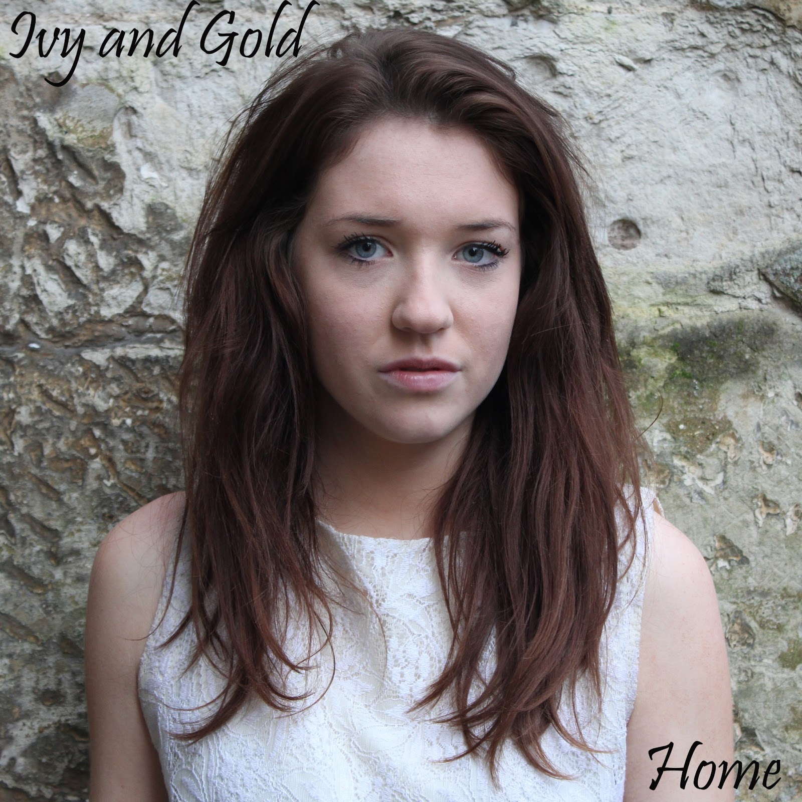
This is the image I originally wanted to use for the front cover of my digipak. Here I used 2 different fonts and asked a few people both from my media class as well as friends what their opinions were on the fonts in order to get both a media perspective as well as a target audience perspective. I also asked the people interviewed to listen to the song so they could get a feel of the genre and how the font would reflect this.
The majority (8/10) chose the more classical font below because "it fitted in with the genre more" and was "more feminine". People also said that "the font also went well with the stone wall on the background". For these reasons I chose this font.

At this stage of my production I thought I had decided on my front cover, but looking through my other photos the one of the front cover below caught my eye. I did the editing on Photoshop and put the artist and album name on in the same positioning as the cover above and thought the white worked much better on the green background and has connections with the model's dress colour. I also think the posture and body positioning of the model works better than the above image. I asked the same group of people on their opinions of this album cover compared to the above one and the majority (9/10) said they preferred the one below.

Sunday, 13 January 2013
Draft of music video
This is the draft of my music video.
The reason for it being a draft is because I originally put it together as my final video, but was unhappy with certain parts of it.
For example at 1.32 where scenes of the green screen in the background are used, the model's miming doesn't match up with the lyrics. All three scenes which are used and put together end at 1.53. This is a section I want to re shoot.
Also, at 2.06 the model is seen laughing at the beginning of the scene so I am going to re shoot that part as well because it doesn't match with the continuity.
Wednesday, 9 January 2013
Madonna magazine advert

Vibrant colours are used to attract the audience's attention and a link is made from the colour of the text and the make up worn by the artist.
A close up shot is used for the image of the artist and we immediately recognise her because of her successful career. 'Ultimate hits collection' tells us the artist is very popular in the music industry.
Direct address is used to make a strong connection with the audience and entices us in to see what the advert is about. Interestingly, the album cover isn't featured on the advert.
Subscribe to:
Posts (Atom)